
Spotify Swaps Like Button For Album Art In The Mini Player
Users are asking Spotify to revert the change.
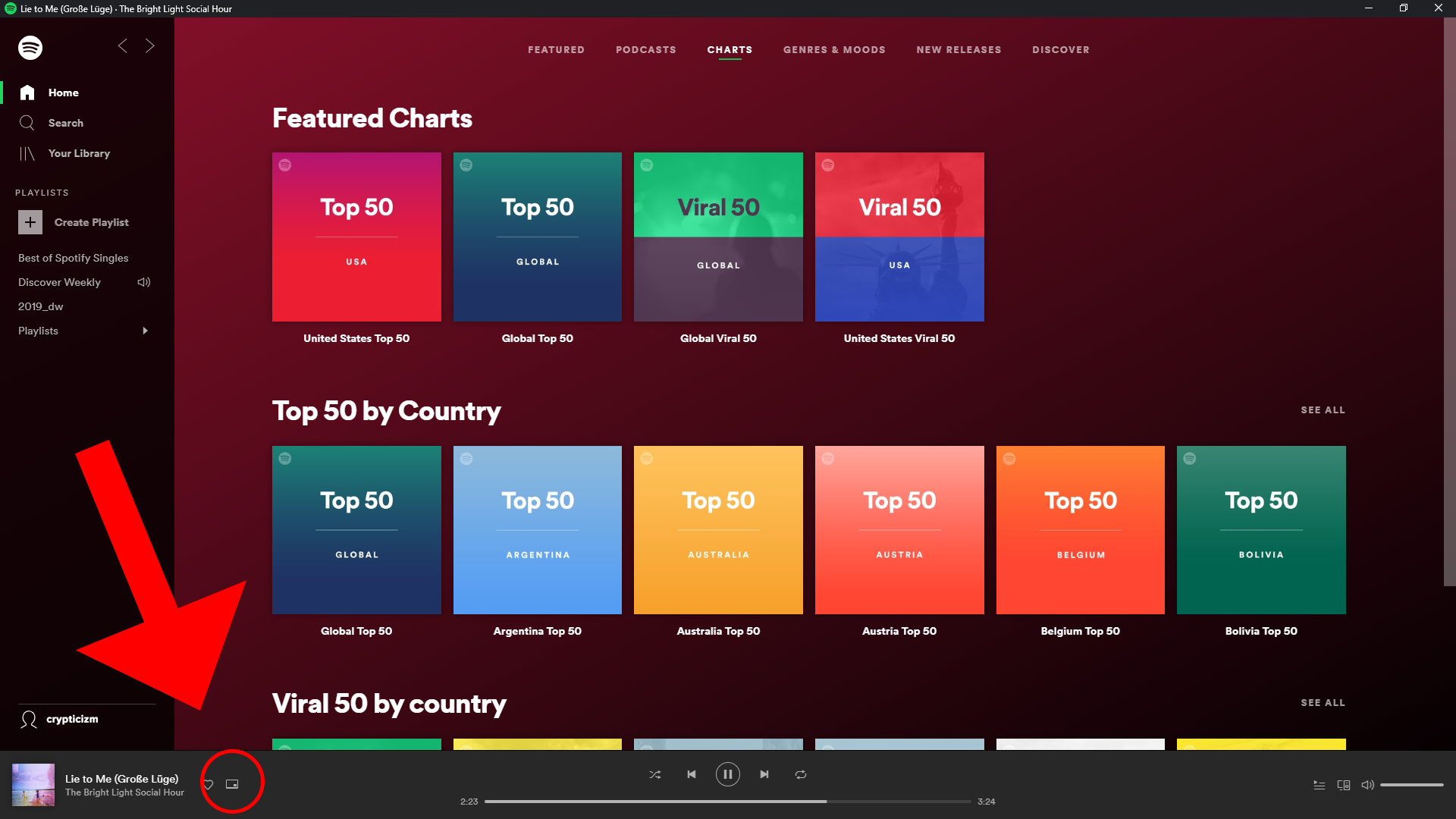
Spotify loves making changes to its app. In a recent server-side test, they replaced the like button in the mini player with the song’s album art. While it looks amazing, there is a loss of function here with this change. While this may look like a tiny change with little to no consequences, it does cost us a bit. The recently changed interface by Spotify has not made the users very happy. The latest update is all about the change of the positions of some buttons. Since most of them were useful, it makes the layout more difficult to use.
Out of all the streaming subscriptions out there, Spotify has become well known due to its ability to predict what you would like to play next. It does this by analysing the music for which you give likes. This means Spotify will find it much harder to understand what you want to play without the necessary heart songs. Of course, there are other ways to heart a song. For instance, using the full media player and hearting it from there. However, this means going around and doing more work on what could have easily been achieved then and there. In this era where companies are working to make devices as straightforward and usable as possible, users balk at the idea of complex workflows or long processes.
In Detail
In the last update, Spotify changed the places of “Repeat” and “Go to queue” buttons into the sub-menu. The sharing button has made its way into the now-vacant place. Before this happened, the more useful “Repeat” and “Go to queue” buttons were right there where we want them. Now, we would have to go to the three-dot menu located on a corner of the screen. Besides being at their old place, the share button can also be seen as part of the song’s “Now playing” screen and also in the sub-menu as well. Users believe that there is absolutely no reason for this UI change. It does not make a lot of sense. It invariably makes life harder. Many users have expressed their not-so-happy opinion on social media platforms, such as Facebook, Twitter, and Reddit.
Which UI?
Spotify is currently working on testing different versions of the mini player. While the album art is located on the left, the like button shows up near the pause/play button on the right. So far, it is still in the early stages and there is no word on which UI they are going to choose. The change might not become permanent or be rolled out widely. In the iOS version, this is how things have been for the last few months. Looking at the feedback of the users, maybe the developers would get things back to normal or maybe find a middle ground to keep everyone happy.
Users are doing their bit by requesting Spotify to go back to its original UI. Many mention that the extra step is annoying and totally insensible. Spotify has not spoken about this yet.
One Comment